
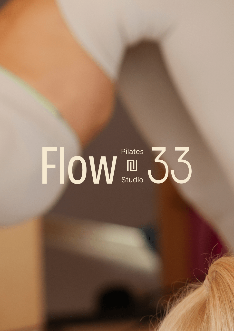
Strap, Stretch, Slay: The gentle flow approach of pilates
Challenge
How can we make the Pilates experience both cozy and invigorating? That was our challenge for Flow 33 Pilates.
Drawing inspiration from their name, "Flow 33," we embarked on a creative journey to craft a brand identity embodying movement without clichés or overly literal interpretations.
Recognizing that fitness was just the beginning for them, we understood that Pilates was a warm-up to a deeper journey of self-discovery and growth.
To convey this message, we aimed to blend Pilates' familiar comfort with an energising burst.
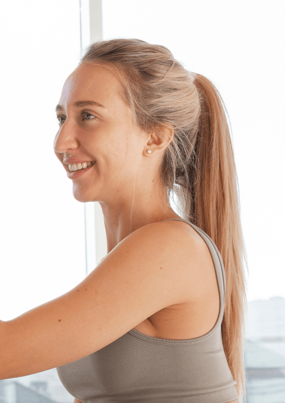
Our strategy focused on creating a space where clients felt at home yet inspired to push boundaries. Because for Flow 33, Pilates isn’t just a workout — it's a journey toward personal growth and self-discovery.


Brand Strategy and Messaging
At the heart of the strategy, we created a friendly, upbeat brand voice that truly connected with their audience.
We aimed for that sweet spot between being approachable and fresh, infusing the brand with a youthful vibe. With "Strap, Stretch, Slay" guiding their tone, we struck a balance between casual and assured, mirroring the relaxed essence of Flow 33 Pilates while fueling their audience's desire for growth.


Brand Design Elements
Our design philosophy centers on a distinctive logomark, inspired by the fluid, bending movements in Pilates. This mark serves as a visual representation of the journey towards self-improvement, capturing the essence of movement and progression.
The colour palette bursts with vibrant energy, injecting life and vitality into every touchpoint of the brand. We chose a typography system that strikes a delicate balance between artistic expression and simplicity, reinforcing their commitment to approachability and accessibility.


Brand Applications
Throughout the brand ecosystem, the logomark takes center stage, radiating inspiration and transformation. It is woven seamlessly into various touchpoints, from signage to digital platforms, creating a cohesive visual language that feels both familiar and refreshingly different.
With a focus on the values of Flow 33 Pilates - gentle movement and growth, we've crafted an experience that speaks to the modern individual seeking balance, vitality and self-growth.


