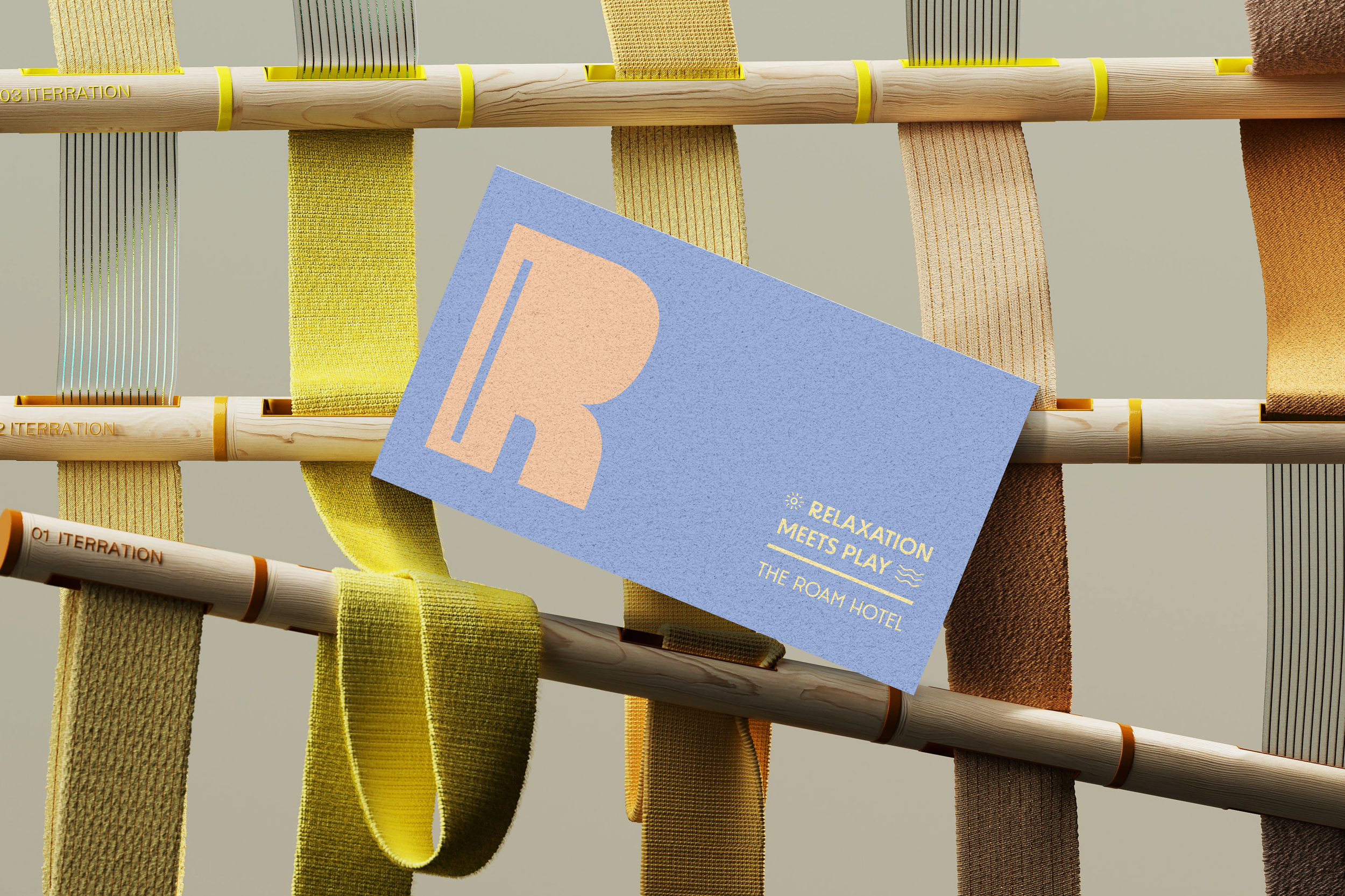
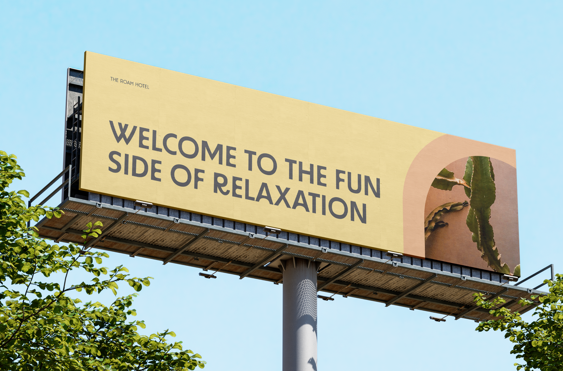
Welcome to the fun side of relaxation - where fun and relaxation co-exists
Challenge
The Roam Hotel was founded with a simple goal in mind: to strike the perfect balance between relaxation and fun. Frustrated by the extremes of boutique hotels, we sought to create a place where tranquility and enjoyment seamlessly coexist.
At The Roam Hotel, their philosophy is clear - relaxation can be infused with excitement, transforming every moment into a delightful adventure.
The challenge was to combine relaxation and fun seamlessly. They needed an identity that reflects the goodness of The Roam Hotel, where guests can unwind and have playful experiences in a harmonious space.


Brand Strategy and Messaging
The brand strategy revolves around ensuring everyone can enjoy relaxation without sacrificing fun.
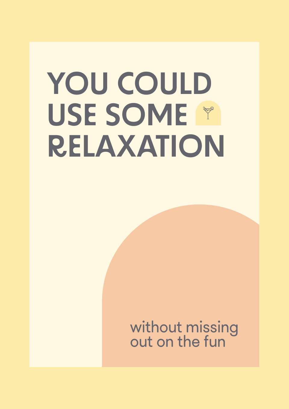
With the tagline "you can use some relaxation without missing out on fun," we focused heavily on the brand atmosphere. Creating serene, welcoming spaces adorned in calming pinks and warm colours, inviting guests to break free from their daily routines.
The Roam Hotel is positioned as an escape from everyday stress, they offer a haven where guests can find peace and happiness. What sets them apart is the unexpected adventure and unforgettable experiences awaiting each guest, from a charming vintage diner to an indoor pool and outdoor island vibes.





Brand Identity
The brand identity of The Roam Hotel beautifully encapsulates the harmony between fun and relaxation without being extreme, showing that these two elements can coexist effortlessly.
Every aspect of the brand is meticulously crafted to blend two worlds seamlessly— relaxation and fun — creating an atmosphere that is both inviting and vibrant.

Logo Design
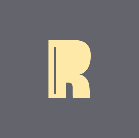
The logo showcases bold, playful typography, centered around a rounded arch shape, perfectly capturing the essence of our brand.
With subtle curved edges, it balances clean typography, blending clean, subtle, relaxed vibes with bold, strong typography.



Iconography Design
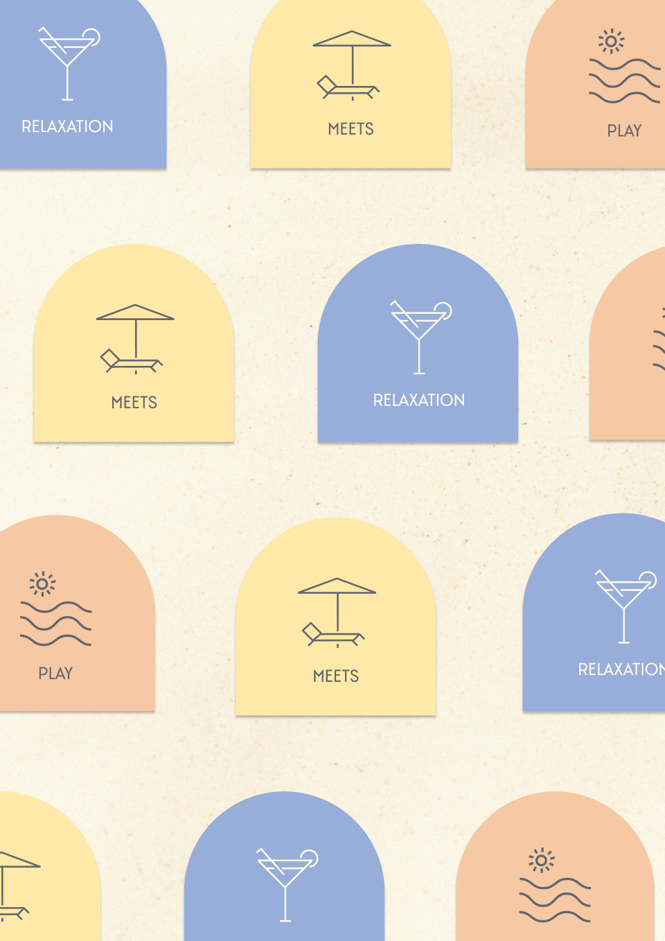
We've extended their brand with minimal, clean-line icons that capture their essence. Each icon is meticulously crafted to embody the structured yet inviting vibes of their brand, reflecting their commitment to simplicity and clarity.



Photography Direction and Colour Palette
The photography direction features a faded and muted tint, creating a light and airy atmosphere. Mixed with pastel colors, the images are vibrant and inviting, drawing viewers into the serene and welcoming world of The Roam Hotel.


